
Photography: Richard Waite
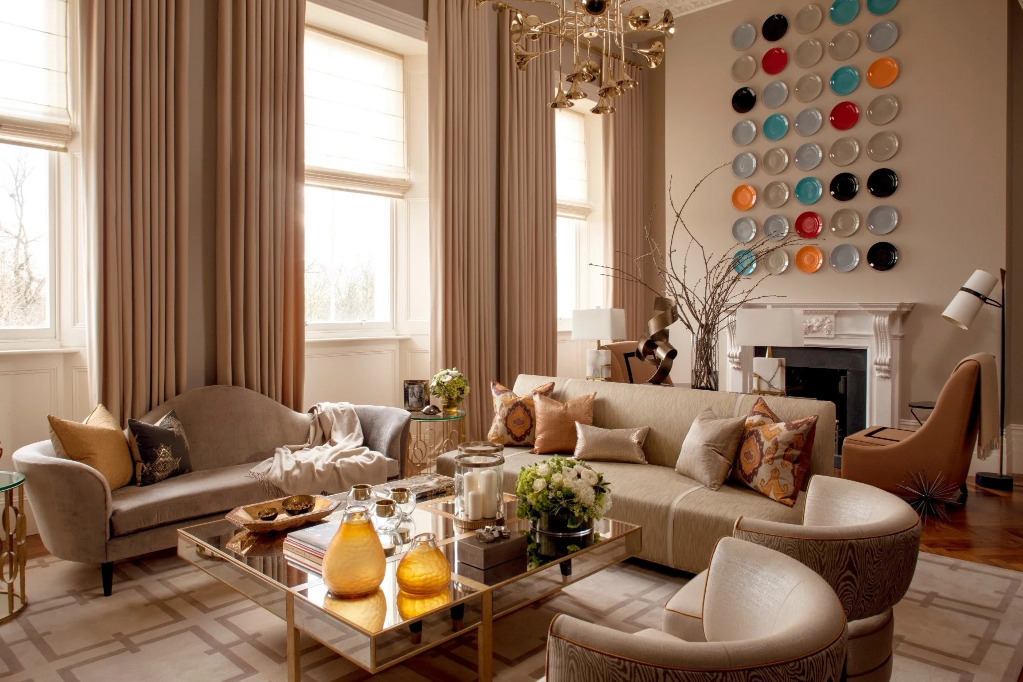
Before I choose a palette or source a single piece, I read a room for proportion: the relationship between ceiling height and floor area, between window size and the wall mass that carries it, and how a room's depth sets the scale of whatever has to fill it. It's an unglamorous way to start, checking ratios before textures, and it rarely shows up in a client presentation. But everything chosen afterwards either sits within those relationships or fights them for the rest of the project, usually without the client ever knowing why.
Proportion has a long paper trail. Palladio built entire villas on ratios borrowed from classical antiquity. The Golden Section appears in door heights, window mullions, and column spacing centuries before anyone gave it a name. None of that is decorative trivia. The eye registers scale before anything else in a room, before colour, before finish.
I have stood in rooms with ceilings too low for their floor area, where the compression feels almost physical, a weight on the shoulders before you can explain why. I have stood in rooms with windows too small for the wall around them, sealed against the outside despite glazing that meets every code requirement. An engineer would sign off on both rooms. A person walking into either one knows immediately that something is wrong, long before they can say what. That gap, between what passes inspection and what a room actually feels like, is why proportion is checked by hand, not left to a compliance drawing. It doesn't photograph as a problem until you're standing inside one.
Brisbane makes the point sharper than in most places I've worked. The light here is generous for most of the year, closer in quality to what I grew up with than to anything I found in London, and a great many rooms were proportioned for a colder, greyer climate that has since been handed light it was never designed to use. Window-to-wall ratios calculated for heat retention leave rooms dim in a city that has light to spare. Verandas and covered outdoor rooms, which function here as real architecture for half the year rather than as seasonal add-ons, still get proportioned like one.
Open-plan living compounds the problem rather than solving it. A single volume now has to maintain the same ceiling height over a kitchen, a dining table, and a sofa, and the proportion that felt generous over the table can feel cavernous over the sofa a few metres away. Furniture scale is usually the first casualty. A sofa bought to fill a showroom floor rarely accounts for the depth of the room it's about to sit in, and a piece that looked substantial in a shop gets lost against a wall it was never measured against. Clients feel this as a room that doesn't come together, without ever naming proportion as the reason: the symptom shows up in the furniture conversation long before anyone traces it back to the shell.
None of this means a designer starts from zero. Most projects arrive with proportions already fixed by a builder or an earlier renovation, and no budget cushion moves a ceiling or widens a window opening. The approach is to find the one relationship the room already gets right, often a single window run or a hallway that happens to land at exactly the right depth, and build the rest of the palette outward from that rather than fighting the whole room at once. Material choices then correct what the architecture didn't manage on its own: a darker plane overhead can pull down a ceiling that feels too tall for its footprint, and paler, more reflective surfaces can push outward a room that runs shallow. Drapery hung near the ceiling line rather than the window head borrows height a window doesn't have, though that trick only works once a designer has stopped pretending the window itself is going to change.
What doesn't work is decorating around the problem and hoping no one notices. A room dressed to distract from poor proportions usually ends up with two problems instead of one.
This is the part of the work that never makes it into a mood board or a client presentation, and it's the part that separates a designed room from a furnished one. Anyone with a good eye can source beautiful pieces. The more exacting work is understanding why a ceiling fights its floor plan, or why a window appears too small against its wall regardless of the curtain treatment. If that underlying relationship is misread, nothing placed on top of it will fully resolve the room.
Proportion is not decorating. It underpins everything else a designer does, and it's where the work actually starts.
Daniel Kostiuc Interior Design is a luxury interior design studio based in Brisbane, offering residential interior design and interior decoration across Queensland, Australia and internationally. Services include new builds, renovations and complete furnishing projects, with space planning, custom joinery, bespoke furniture, furniture selection, lighting, art and accessories for high-end homes.