
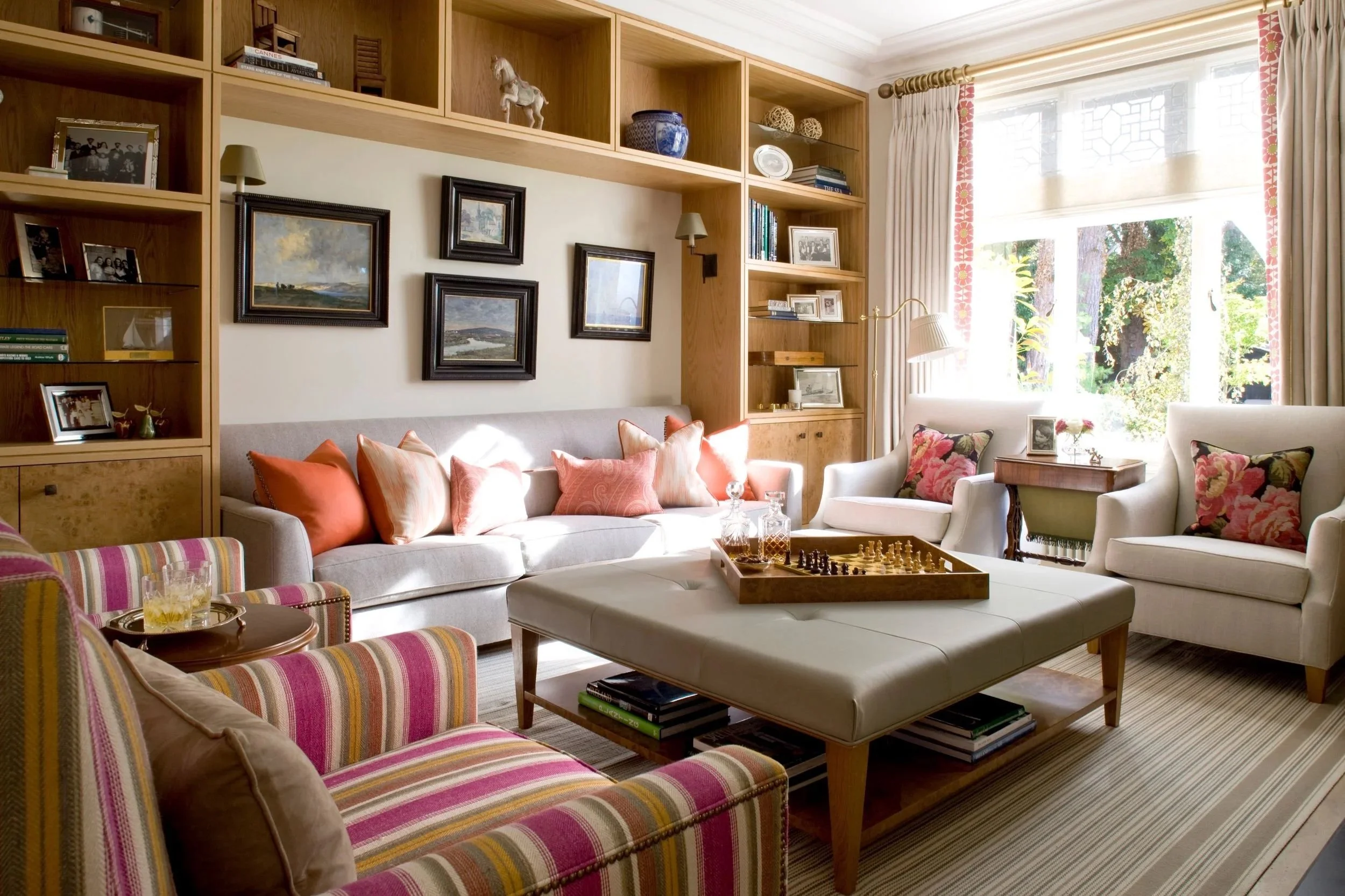
Photography: Richard Waite
On one project, the palette for a drawing room began with a large abstract painting the client intended to keep. It featured mineral blue, tobacco, chalk, black and a small flare of faded coral. Repeating those colours literally would have reduced the painting to a decorative reference, so we allowed them to travel through the room more discreetly: warmer wool instead of blue silk for the chairs, a rug carrying only a trace of blue, and dark bronze to draw out the black without competing with it. The painting remained the most complex object in the room, while everything around it seemed to understand its place.
Colour is rarely resolved by finding a single exceptional shade. It develops through friction, reflection and proximity. Timber brings yellow, red, brown or grey into the scheme before anything else is chosen. Stone introduces veins, clouds and mineral shifts that refuse to behave like a flat sample. Metal reflects what surrounds it or absorbs light, darkening the surface. Fabric can make the same colour appear soft, sharp, lustrous or almost dusty. Even the quietest interior contains far more colour than it first admits.
This becomes most apparent when pale materials are placed together. Limestone can feel warm beside greyed oak and unexpectedly cool beside walnut. Ivory fabric may look clean against bronze and slightly green beside certain marbles. None of these materials has changed, yet each alters the temperature of the next. I prefer to judge them in generous pieces and complete compositions, because a tray of small samples can obscure the very relationships that will dominate the finished room.
Light adds another layer. Brisbane daylight has a particular intensity. It can bleach the subtlety from a delicate textile, sharpen the reflectivity of stone and make polished metal throw light back into the room. Morning may clarify cooler colours, while late afternoon deepens shadows and warms everything it touches. After dark, the palette changes again. Timber may become richer, reds more saturated and certain blues unexpectedly flat. Colour has to survive all these versions of the room.
Distribution matters just as much as selection. A strong colour used once can feel stranded. Repeated too faithfully, it can look overdesigned. I prefer colour to move through a room with variations in strength and material: softened in a rug, clearer on a chair, darker in an artwork, perhaps reduced to a narrow border on a curtain. Often, the connection is felt before anyone consciously identifies it.
The same principle applies across a house. Each room should have its own atmosphere, but transitions between rooms should feel deliberate. A colour glimpsed through one doorway may return several shades deeper in the next, or move from fabric into stone, lacquer or timber. Hallways are especially powerful because they turn one room into the frame for another. A pale entrance can intensify the drama of a darker drawing room beyond it. A muted corridor can make a room of stronger colour feel almost luminous on arrival.
Contrast gives the palette its structure. A pale room may need one dark cabinet, chair or frame to prevent lighter materials from dissolving into one another. A deep wall colour can make gilt, veined stone or pale upholstery appear more vivid. Some rooms draw their depth from a narrow range of tones, with variation carried by texture and sheen. Others need a decisive interruption. Without it, the room may be elegant but strangely inert.
Scale remains critical throughout the process. A paint chip reveals very little about how a colour will perform across a wall. Fabric needs to be unfolded. Stone needs to be seen as a slab. Lacquer, metal and timber finishes should be placed beside the materials they will eventually meet. I bring these elements together repeatedly while the design is still open to change, often removing colours that seemed compelling on their own but weakened the composition once the full palette was visible.
Colour is built through these exchanges. One material gives another warmth, clarity or depth. A darker note can steady a room, a pale one can release it, and a flash of something unexpected can bring the entire composition to life. By the time the furniture, finishes and art are installed, those relationships feel inevitable. The work lies in creating that inevitability before the room exists.
Daniel Kostiuc Interior Design is a luxury interior design studio based in Brisbane, offering residential interior design and interior decoration across Queensland, Australia and internationally. Services include new builds, renovations and complete furnishing projects, with space planning, custom joinery, bespoke furniture, furniture selection, lighting, art and accessories for high-end homes.