
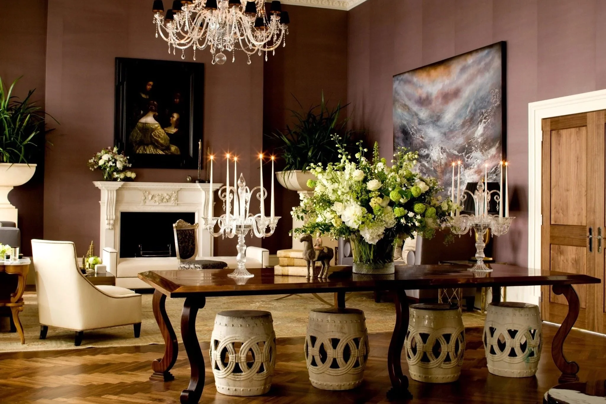
Photography: Richard Waite
When I left Los Angeles for London in the late 2000s, I believed I understood proportion.
I had spent time in one of the most visually rigorous studios in American interior design. I could talk about scale with some confidence. I understood the relationship between furniture dimensions and floor area, between ceiling height and the weight of the objects beneath it. I had absorbed these things from capable people who thought about them constantly.
Then I walked into a Georgian townhouse in Kensington that had been recently renovated, beautifully and expensively, by someone who also understood proportion. Or thought they did.
The room was wrong. I could not immediately say why. The materials were excellent. The furniture was well chosen. The palette was considered. And yet standing in it produced a faint but persistent discomfort, as if something in the air was slightly off.
I spent longer in that room than I should have, trying to identify the problem. Eventually, I found it. The ceiling had been raised during the renovation. Not dramatically. Perhaps forty centimetres. But the floor-to-ceiling height, which had previously been in a specific relationship to the width of the room that Georgian architecture had calibrated with great precision, was now wrong. The room was taller than it was wide enough to be, and the result was a sensation of compression that had nothing to do with how much space there was and everything to do with how the space related to itself.
This experience changed how I think about proportion. Not as a design decision but as a physical fact. Proportion is felt before it is understood. A room that feels wrong when empty cannot be rescued by what is placed inside it.
The same principle governs light.
Light is not a backdrop against which design decisions happen. It is the most active material in any room, and the only one that changes constantly. Everything else, the floor, the walls, the furniture, the objects, is static. Light is in continuous motion from dawn to dusk, rewriting every surface it touches as it moves.
I have seen the same room at 7 am and at 7 pm and been unable to recognise it as the same room. The material that absorbs morning light beautifully can become harsh in the afternoon. The colour that looks resolved under daylight can appear completely different under artificial light in the evening. These are not anomalies. They are how light works. The designer who does not account for this is not designing the room as it actually exists. They are designing a version of it that exists only at the moment of the photoshoot.
In Brisbane, this understanding has been both confirmed and deepened. Brisbane's light is directional in a way that London's diffuse northern light is not. It falls at angles that create shadows I had not worked with before. It reveals texture in materials that would appear flat under grey English skies. And it demands a material palette calibrated to these conditions rather than to a different hemisphere's relationship to the sun.
Glare management, which in London is rarely a primary design consideration because there is rarely sufficient direct sunlight to manage, is here a foundational decision that shapes everything downstream of it. The louvre, the deep eave, the frosted screen, these are not supplementary features. They are the design.
The third principle is colour, and it is the one that most designers get wrong most often, for a simple reason: they treat it as the first decision rather than the last.
Colour is the most emotionally immediate quality of any room. It is also the most dependent on everything else. A colour that works in one orientation, one light condition, one material context, will fail in another.
My working principle: colour is the last decision, not the first. First understand the proportion of the room. Then understand the light. Then choose your materials in response to both. Colour emerges from this process. It is not the starting point.
This is not a fashionable view. But a room designed around a colour will always be less resolved than a room in which the colour was the last considered element. In the first case, you are asking the room to serve the colour. In the second, the colour is serving the room.
Proportion is felt before it is understood. Light is the primary material. Colour is the last decision.
These three principles do not change regardless of budget, scale, location, or client. They apply to a modest renovation in Paddington as directly as they apply to a prestige apartment in South Bank. They will apply in every context I work in for the rest of my career.
The designer who understands them is working with how rooms actually function. The designer who does not is working with how rooms appear in photographs.
There is a significant difference between these two things, and the person who lives in the room will feel it every day.
Daniel Kostiuc Interior Design is a luxury interior design studio based in Brisbane, offering residential interior design and interior decoration across Queensland, Australia and internationally. Services include new builds, renovations and complete furnishing projects, with space planning, custom joinery, bespoke furniture, furniture selection, lighting, art and accessories for high-end homes.